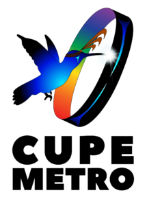
Our logo was created by Rain Pierre in collaboration. It was a great experience, and Rain was wonderful to work with. We talked about what CUPE Metro is, who we are and what we want to keep working for.
In 2023 our Executive Board started discussing changing our logo. The old logo was beautiful, but we didn’t have any information about who created it and why it was chosen. We also didn’t have a range of files to use for different uses.
Thanks to Rain, we can share the story of our beautiful logo:
The hummingbird was chosen because it is relatable to everyone. Whenever someone sees a hummingbird, they get this sense of happiness and connection. I chose this because it is unique. Hummingbirds are the only birds that can fly backwards.The hummingbird is wearing a cedar headband, as a tribute to our people’s culture and traditions – both of which we must uphold as we grow. There are 3 strands on the headband to acknowledge the past, present and future – all of which we must to take into account for any major changes within our systems.I have added the rainbow colours within the ring to represent all people from all walks of life to be helped by CUPE.The shining star is to remind us of our ancestors as we move forward and remember the light that shines within us.The hummingbird is passing through a circle to represent us going through a full cycle of life.

